Role:
Information Architect
Team:
1 Researcher
Timeline:
2 Weeks
March 2025
Tools:
Figma
Figjam
Google Forms
Project Overview
Project Overview: Culinary IA Lab: Organizing Gourmet Content with User Input
Research Project | UT Austin Post Graduate Program in UX Design
This project aimed to improve the information architecture of a gourmet and specialty food website by analyzing competitor navigation strategies, conducting a card sorting exercise, and developing a user-informed sitemap. The goal was to create a structure that supports intuitive browsing, efficient product discovery, and seasonal relevance.
Competitor Analysis
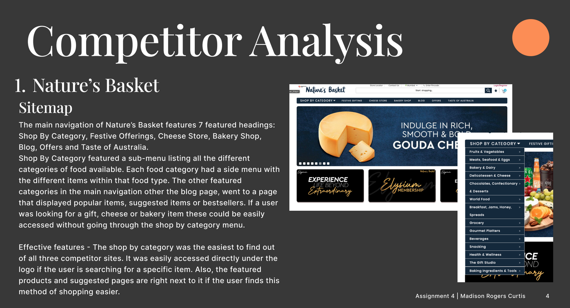
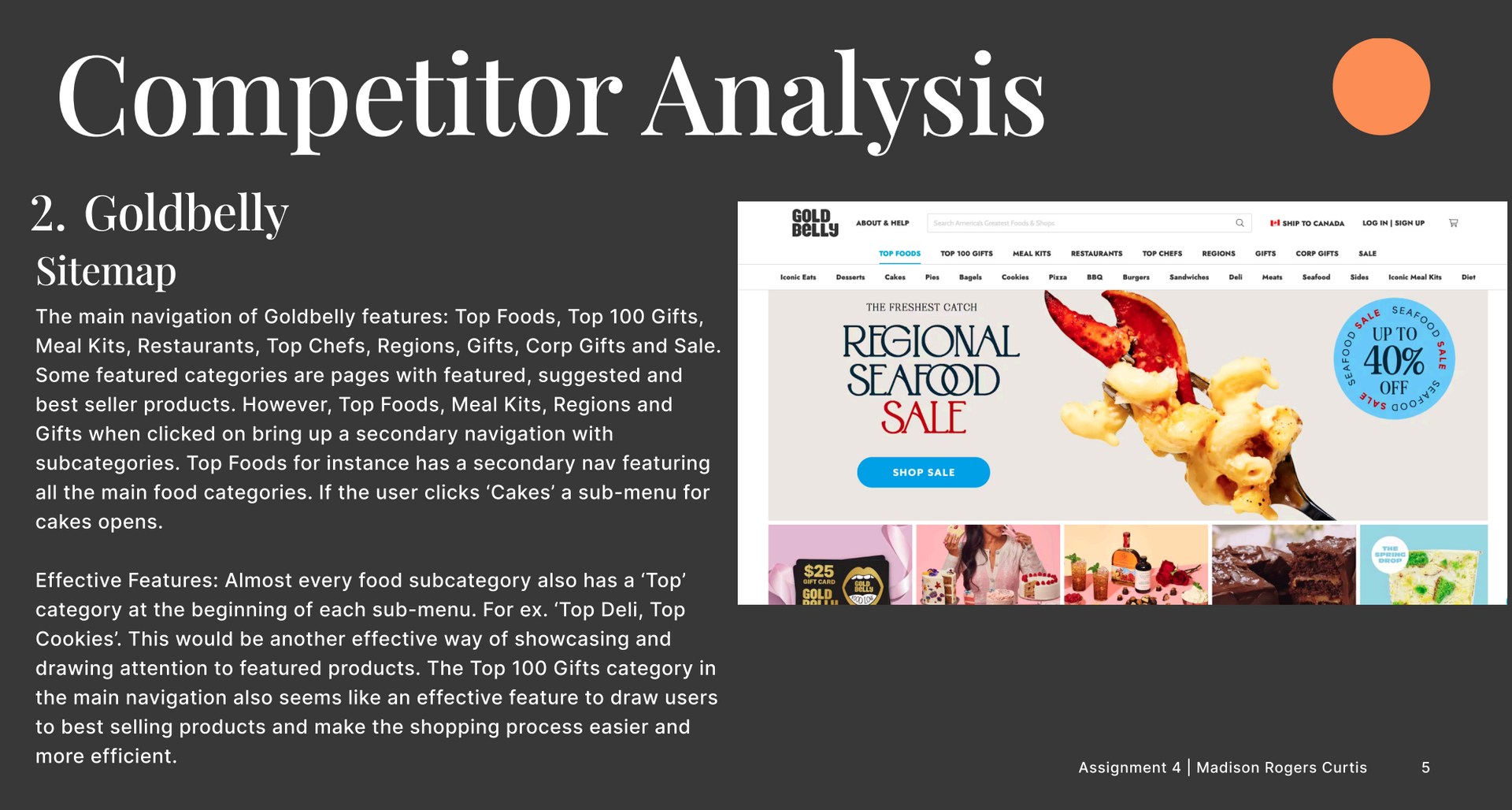
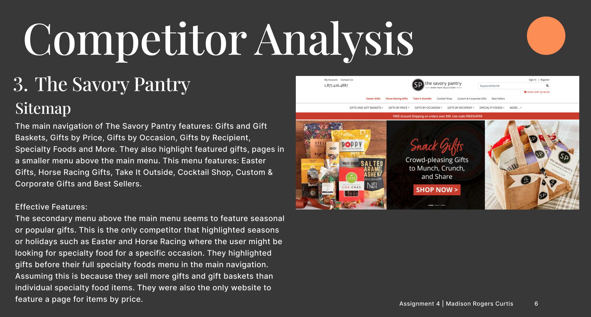
Three leading specialty food websites—Nature’s Basket, Goldbelly, and The Savory Pantry—were reviewed to identify effective navigation patterns and content organization. Nature’s Basket emphasized a “Shop by Category” dropdown with layered submenus, making it easy for users to browse by food type. Goldbelly used secondary navigation to highlight top products and featured categories like “Top 100 Gifts,” which streamlined discovery. The Savory Pantry prioritized gift baskets and seasonal offerings, using a secondary menu to spotlight holidays and occasions. Across all three, common patterns included featured products, search bars, and login/register options, but each site varied in its emphasis on gifts versus individual food items.
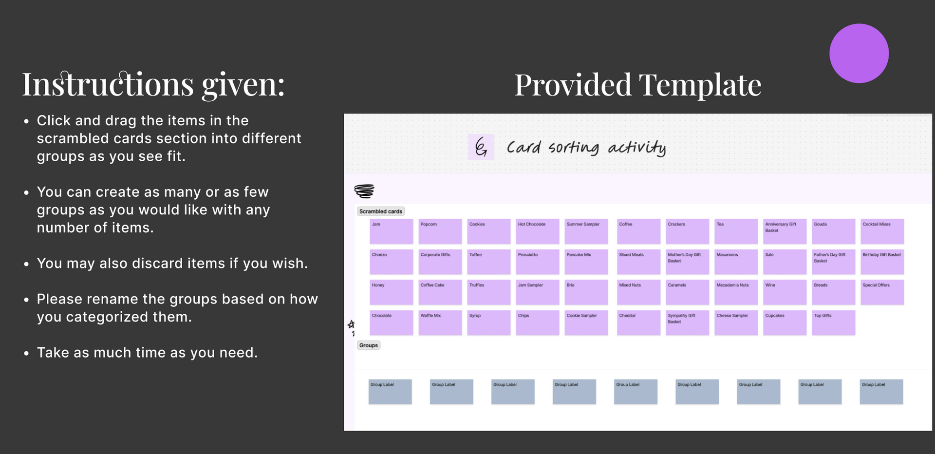
Card Sorting & Results
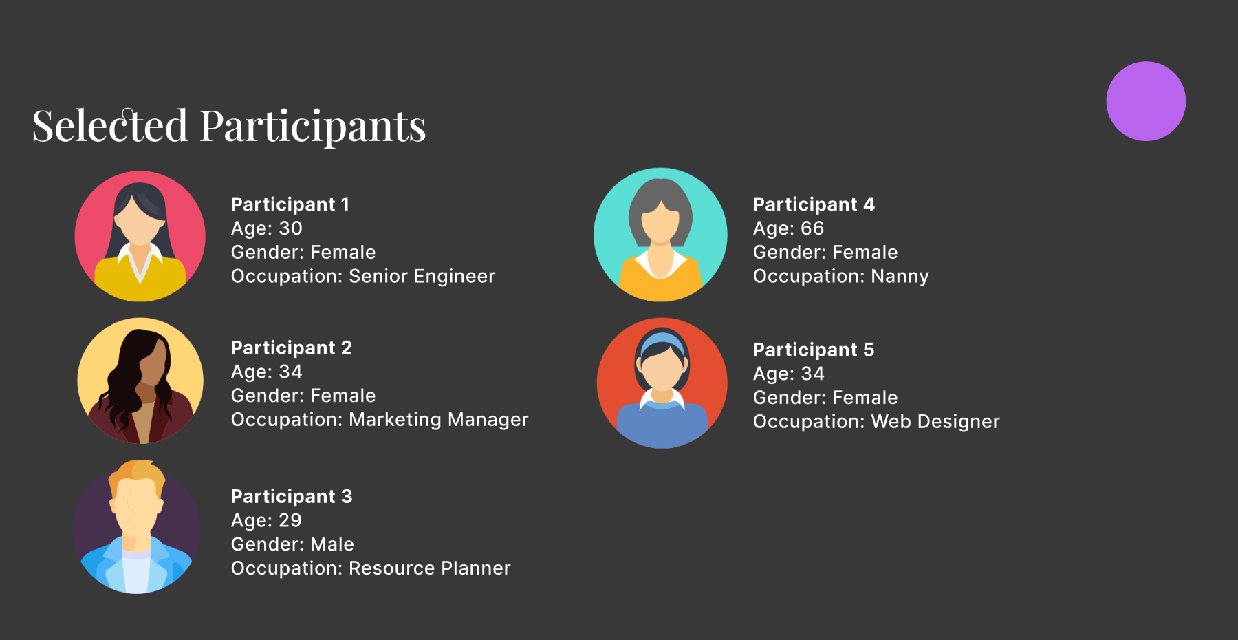
A card sorting activity was conducted with five participants from diverse age groups and professions. Each participant grouped 45 food and gift items into categories based on their own logic and labeled them accordingly. Common categories included Sweets, Drinks, Breakfast, Charcuterie Board Items, Snacks, and Gifts. Some participants introduced unique groupings like “Things to Enjoy at the Beach” or “Occasion Baskets,” while others emphasized deals and seasonal relevance. The frequency analysis of item placement across categories revealed consistent patterns that informed the structure of the final sitemap.
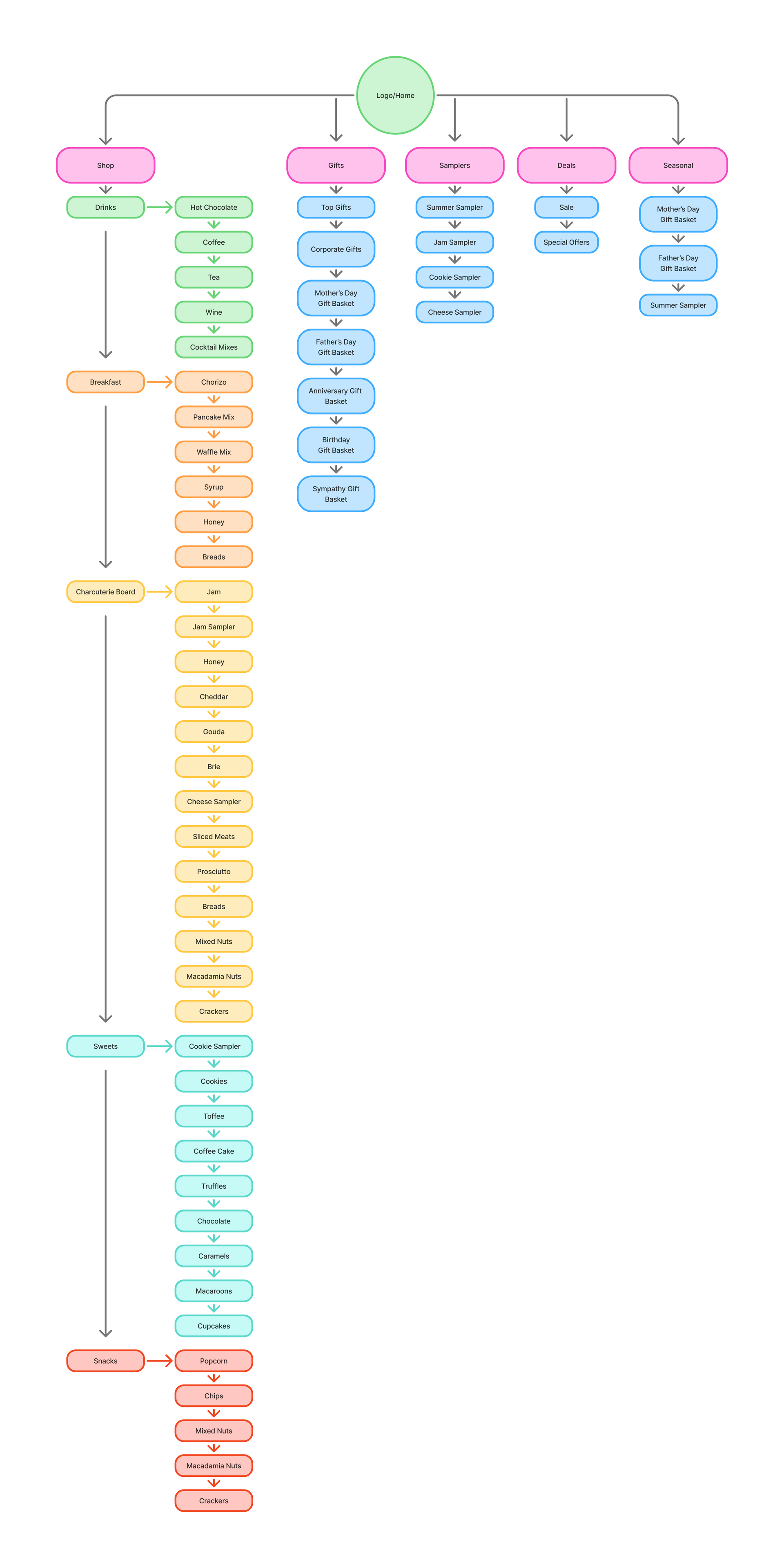
Recommended Sitemap
The final sitemap was designed using both card sort data and insights from competitor analysis. The main navigation begins with a “Shop” tab, allowing users to browse by product type—Breakfast, Charcuterie Board, Sweets, Snacks, and Drinks—based on the most frequently used categories. A “Deals” tab highlights Sale and Special Offers, reflecting user interest in promotions. The “Gifts” tab features “Top Gifts” first, inspired by Goldbelly’s bestseller strategy. A “Seasonal” tab was added to showcase occasion-based items, drawing from The Savory Pantry’s effective use of holiday-specific promotions. This structure balances user expectations with business goals, supporting both browsing and targeted shopping.
What I Learned
This project reinforced the value of user-centered design in structuring digital experiences. I learned how card sorting can reveal intuitive patterns in user thinking and how competitor analysis can complement those insights with proven strategies. By combining qualitative data with strategic design thinking, I was able to create a sitemap that feels both familiar and functional to users.